In most of images that we take during data acquisition, we only want part of the image that contains that data the we need. There are a lot of ways to do this; it can even be done using template matching. For this activity, what we do is we use the color of the region of interest (ROI) to separate it from the whole image.
There are two techniques that can be done in color segmentation. They are the Parametric and Non-Parametric segmentation. Both of these techniques use a portion of the ROI.
Each pixel in a colored image has RGB values. What we do in parametric segmentation is that we take the fraction of the RGB values that is in each pixel in the portion of the ROI. That is:

where 


This means that we only need to obtain the r and g values.
In parametric segmentation, we obtain the r- and g-values of a portion of the ROI. Then we obtain the mean r and mean g values, given by μr, μg and the standard deviation values, σr, σg, respectively. After obtain the mean and standard deviation, we obtain the probability that a pixel belongs to the ROI using the r and g values of the pixel. The probability for r (and g) is given by:
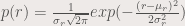
where r is the r-value of the pixel. The same form is also used for g-values. After obtaining p(r) and p(g), we obtain p(r) * p(g) which will give us the probability of the pixel being part of the ROI. We show in figure 1 the image that we used, and in figure 2, the portion of the ROI where the mean and the standard deviation are obtained.
Figure 1. The ROI are the flowers.
Figure 2. A portion of the flowers.
Figure 3 shows the probability of each pixel. We can see that the flowers are separated from the whole image.
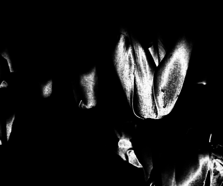 Figure 3. The flowers are separated from the other parts of the image.
For the next technique, we use a histogram. This histogram is created using the r and g values of the portion of the ROI. We convert the r and g values into integers and binning the image values in a matrix (Soriano, 2013). The quality of the segmentation depends on the size of the bin that is used. In figure 4, we show the result of the non-parametric segmentation with different bin sizes.
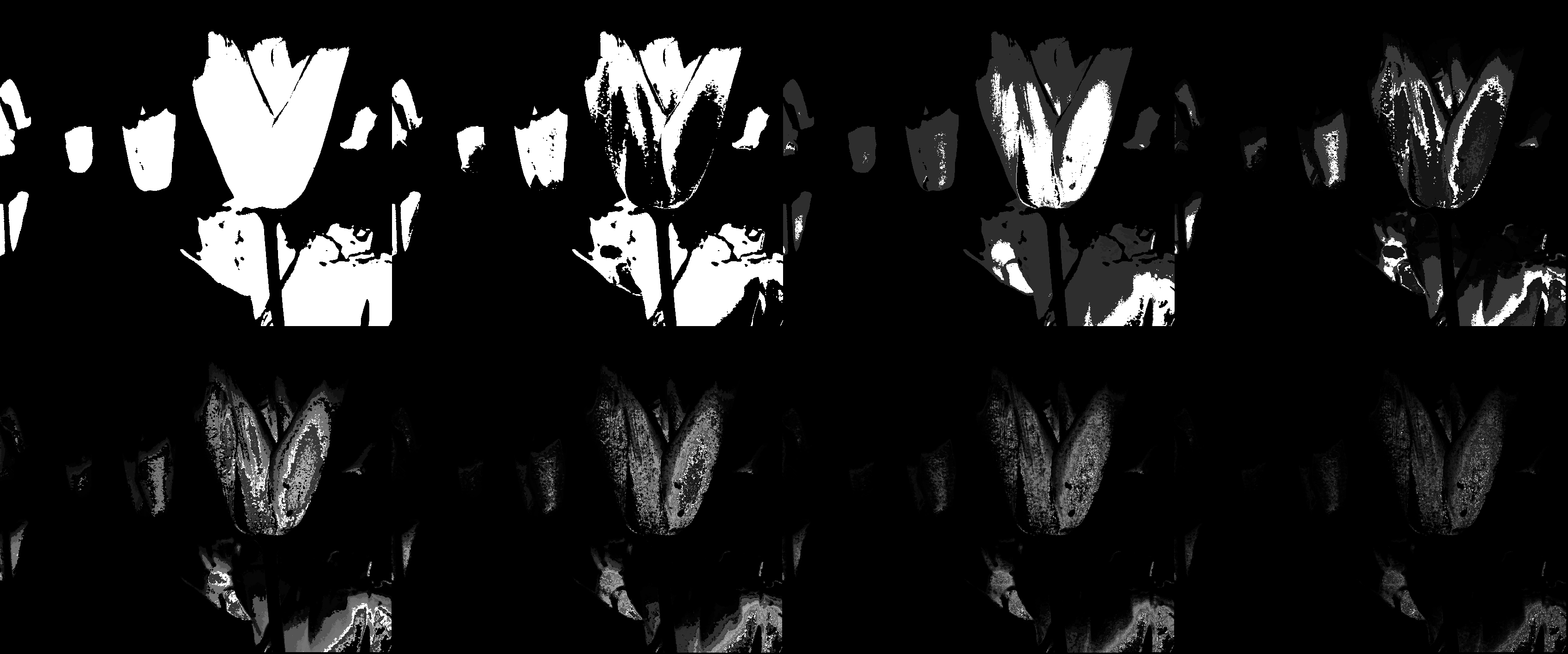 Figure 4. left to right, top to bottom: bin size = 2, 4, 8, 16, 32, 64, 128, 256
From figure 4, it can be seen that the lower the bin size, the constraint becomes too loose such that even other objects in the image are segmented. The higher the bin size, the lesser the details are segmented until such that even some of the objects that are needed are not segmented. It all boils down to choosing a good bin size.
In comparison, the parametric segmentation yields better results, since the flowers have a higher brightness, and no other objects are captured. However non-parametric segmentation is faster since the look up table (the histogram) is present and no further calculation is needed. I show another example in figure 5.
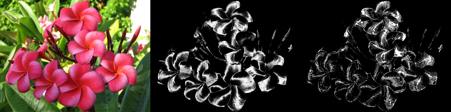 Figure 5. The left image is the original, center the result of parametric segmentation, and right the result of non-parametric segmentation. The difference between the quality of parametric and non-parametric segmentation is seen. The parametric segmentation captures more area of the flowers.
I give myself a grade of 6/10, since this blog is overdue. I thank Ms. Abby Jayin for her help in understanding the concepts.
Sources:
Color Segmentation by Dr. Maricor Soriano.
 is the coefficient for the function
  . The functions
  and
and  can be obtained using a single line of code. . If X is the matrix containing the signals (each column being an individual signal), the principal components and the coefficients can be obtained by:
![[lambda, facpr, comprinc] = pca(X);](https://s0.wp.com/latex.php?latex=%5Blambda%2C+facpr%2C+comprinc%5D+%3D+pca%28X%29%3B+&bg=eeeae8&fg=4a4a49&s=0&c=20201002)
 parts. Then we convert each part to a single matrix with size
  . Each
  .
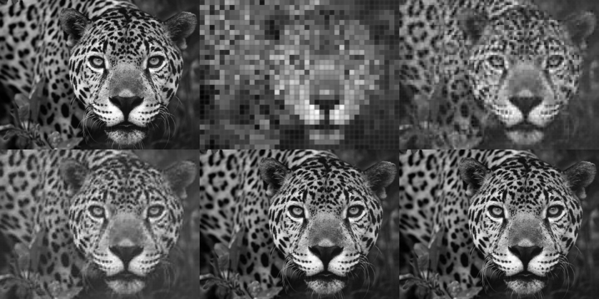
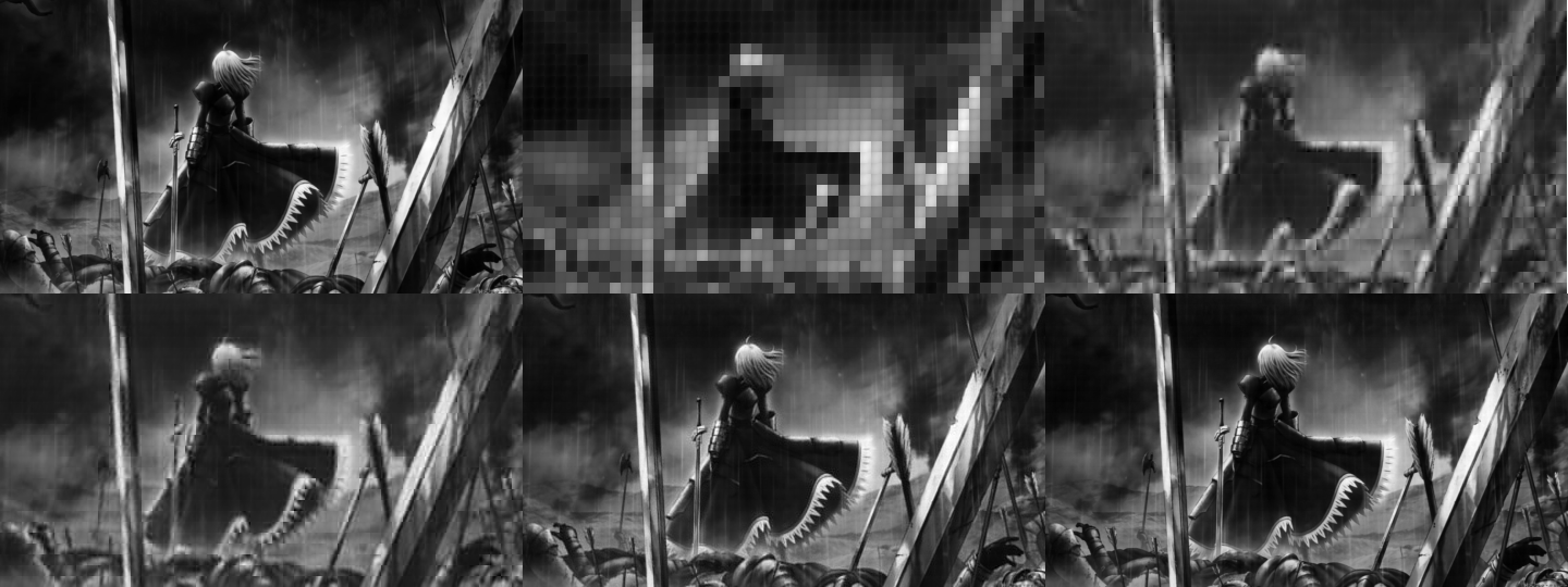
. principal components. What we will then do is try to reconstruct the images using the principal components. Because each principal component have different percent contribution, we will investigate what will happen to the reconstruction if we use only n principal components (0<n<100).