We finally get to play around with Fourier transform!
For this activity, we are going to familiarize ourselves with the discrete Fourier transform, specifically the Fast Fourier Transform (FFT) by Cooley and Tukey. Then using the FFT, we apply Convolution between two images. Next is Correlation, where we use the conjugate of the image. Lastly, using convolution, we do an edge detection.
1. Familiarization with FFT.
One theorem in mathematics is that, all wave forms can be decomposed into sinusoids. That is, the function can be expressed as a sum of sines and cosines. Though this theorem may sound gibberish at first, we will explore the wonders that this theorem has given us. 🙂
Breaking down a function into sinusoids gives us the “ingredients” in making that function in the frequency domain. This is done using the Fourier Transform, the equation as follows:

where  is the FT of the function
  . is the amplitude of the frequencies found in . The equation above is for one dimensional Fourier transform, where graphing will give the peaks corresponding to the values of
  (frequency) that the function contains. However, here, we are going to deal with two-dimensional Fourier transforms since we are dealing with images. The 2D Fourier transform is shown:

where  is the 2DFT of
  , being the frequencies in the x direction and
  the frequencies in the y direction. However, in the real world, data is discrete when existing sensors, or sampling instruments, sample any data set. Meaning that data is not continuous and that only some values of the data set is captured. An example of this would be the camera. When we look at the properties of the image captured by the camera, we see something that is called the pixel. Images are composed of pixels, so when an image is zoomed in, the details become distinct and not continuous; squares of different colors can be observed. When you compare this to the real world, you cannot see small squares when “zooming in” the real world objects. Though you cannot determine position and momentum of particles in exact values at the same time, but that topic will not be tackled here. =,=
Because real data is discrete, we cannot apply the integral above, since integrals are applicable to continuous systems. Cooley and Tukey (1965) derived the fastest discrete Fourier transform algorithm still used by many programming languages today. The algorithm is often called the Fast Fourier transform (FFT). It is shown by the following equation:
where f(n,m) is the value of the image in the  x value and
  y value with size
  . This algorithm is being used in a lot of applications; radar, ultrasound, basically almost anything that includes image processing.
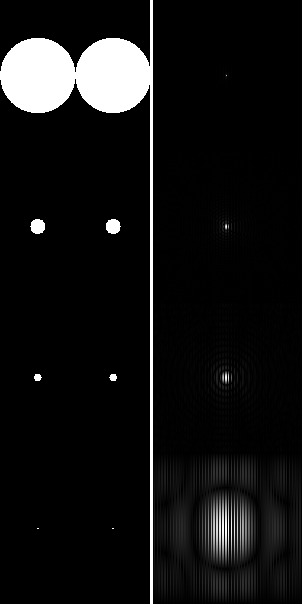
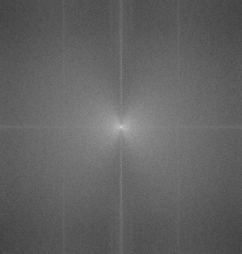
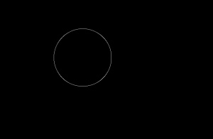
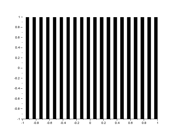
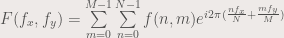
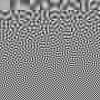
The FFT algorithm in most programming languages has the diagonals of the output interchanged. Because of this, a function called the fftshift is often used to correct the placement of the diagonals. In figure 1, I show the result of the FFT of a circle with aperture radius equal to 0.1 of the maximum radius that can be created, with and without the fftshift function:
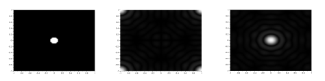
Figure 1. We show the FFT of a circle(left) without(center) and with(right) the fftshift. Analytically, the FFT of a circle is an airy pattern, which can be seen in the image on the right.
We can see that the fftshift function is really important to obtain the correct FFT of an image. Figure 2 shows the FFT of the letter A, and also the images showing what happens if FFT is applied twice to the same image and if IFFT is applied after the first FFT.
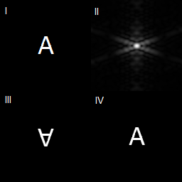
Figure 2. The top left image shows the letter A. The top right image shows the FFT of letter A (already fftshift-ed). The bottom left image shows what happens if you apply FFT twice to the letter A. The bottom right shows if you apply the inverse FFT after application of FFT to letter A.
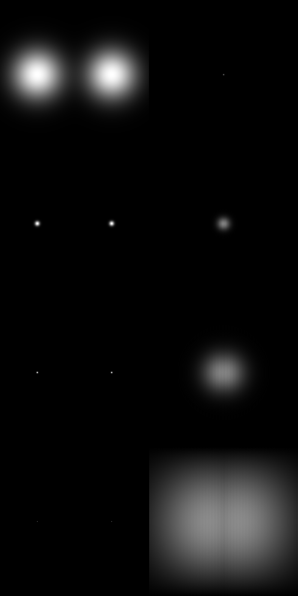
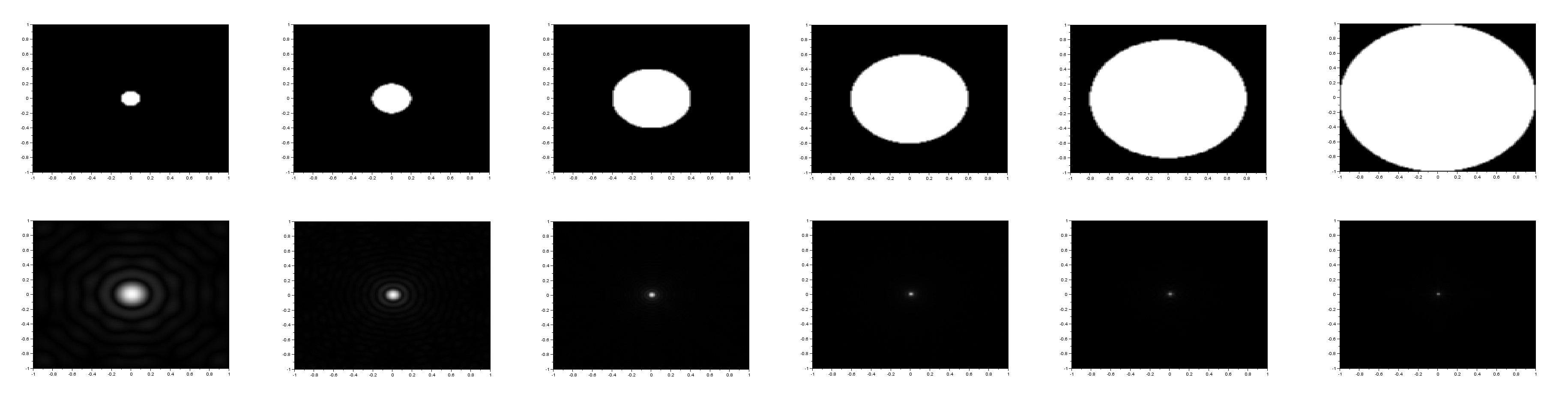
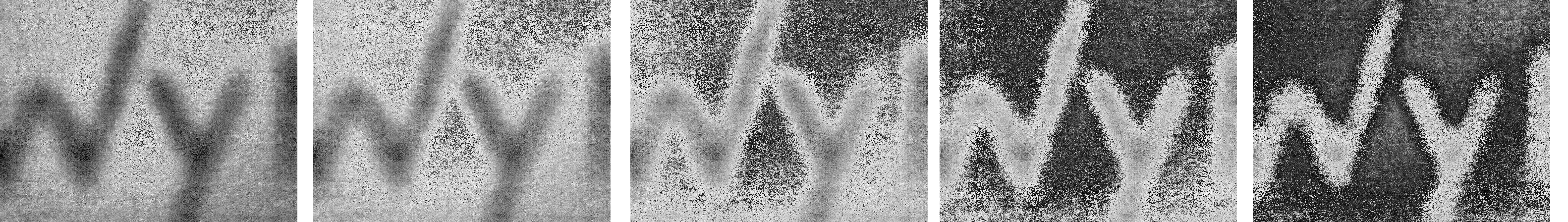
It can be seen in figure 2 that if FFT is applied twice, the image becomes inverted, while if IFFT or inverse FFT is applied after application of FFT, the image becomes upright. The next image shows the FFT of circles with different sizes, ranging from 0.1 of the maximum radius to 1 times the maximum radius.
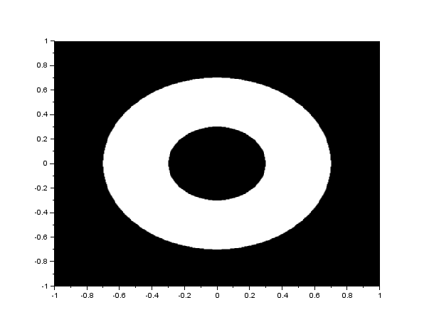
Figure 3. The circles with different radii, shown with their FFTs. The circles have width equal to (from left to right) 0.1, 0.2, 0.4, 0.6, 0.8 and 1 times the maximum radius. The results agree with the theoretical that says, the smaller the circle, the more detailed the airy pattern is. The theory will not be discussed here.
2. Convolution
Convolution is a linear operation that basically means smearing one function with the other (Soriano, 2013) such that the resulting function has properties of both functions. The convolution is represented by an *. So if two functions are convolved with each other, they are represented as (in integral form):

or in short hand form:

Since the FFT is a linear transform, and convolution is a linear operation, the FFT of a convolution is multiplication of the two functions being convolved. Basically:

where F, H and G are FFTs of f, h and g, respectively. Convolution is used to model sensors and instruments that are used to sample data sets, since sensors also affects the values of the data, whether the sensor be a linear system or second order system or higher order. An example of a sensor that affects how data is captured is a camera, where the resulting image (f) is a convolution of the data itself (g) and the aperture of the camera (h).
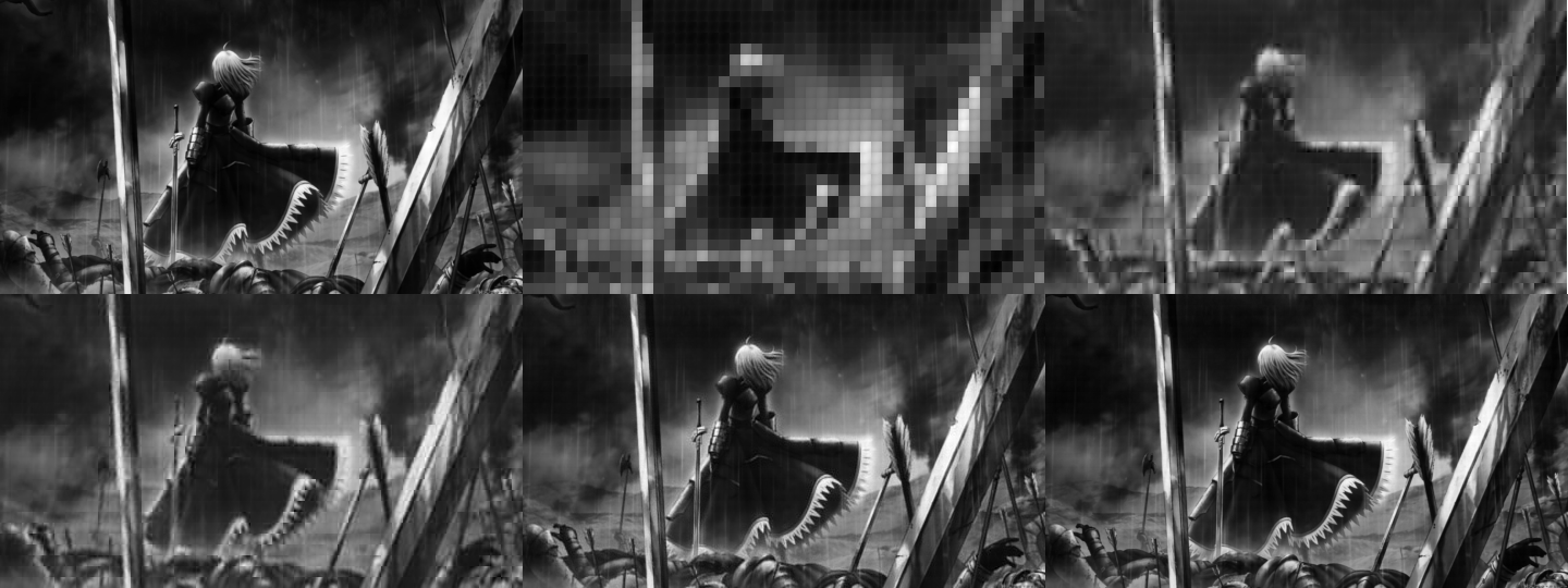
The equation of a convolution is oftentimes more difficult than just applying FFTs. So in this part of the activity, we apply FFT to both functions g and h, and multiply them, then apply IFFT to obtain the convolved function f. With g as the VIP image and h as the camera aperture, we apply convolution operation. We show the results in figure 4.

Figure 4. The top left figure is the VIP target. Then the following images (from left to right, top to bottom) are the results from the VIP image being convolved with different aperture sizes (1.0, 0.8, 0.4, 0.2, 0.1, 0.05, 0.02)
It can be observed from figure 4 that the smaller the aperture size, the clearer the image becomes. This is because the smearing becomes less and less as the aperture size becomes smaller. So the smaller the aperture size, the higher the image quality.
3. Correlation
The second concept that we will discuss here is called correlation. Correlation is the link between two data sets, or in this case, between two images. This concept is often used in template matching because it answers the question “how same are these two images?”. The equation of correlation is given by:

or in shorthand notation:

We can see that the integral equation of correlation looks like the convolution. The two are related by the following, where we can show correlation in a convolution equation:

The same as convolution, correlation is a linear operator, so applying FFT will lessen our load (such as not doing the integral shown above). The correlation has the following property:

where  is the complex conjugate of
  . We use the correlation in template matching, or in finding out how similar are the two images in a position
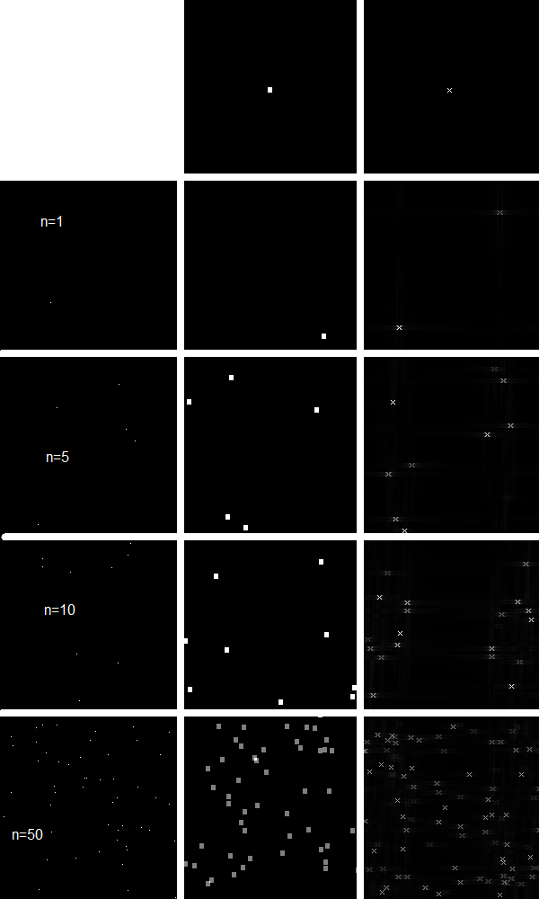
  . We use the sentence THE RAIN IN SPAIN STAYS MAINLY IN THE PLAIN and correlate it with an image of the letter A using the FFT relationship above. Then by thresh holding, we obtain the positions in which the images have a high correlation. We show the result in figure 5.
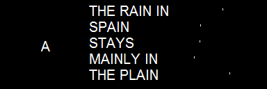
Figure 5. We do template matching using the sentence THE RAIN IN SPAIN STAYS MAINLY IN THE PLAIN and the letter A. This basically means we find the places in the second image where the first image can be found, or is most similar. The white dots in the third image in the right shows those locations. If we observe further, the white dots in the third image corresponds to the locations of the A’s in the second image. Because these are the places where the letter A is most similar in image 2.
We can see that after thresh holding, the places with the highest correlation value are the places in the second image where the letter A is found. This is what template matching means.
4. Edge Detection
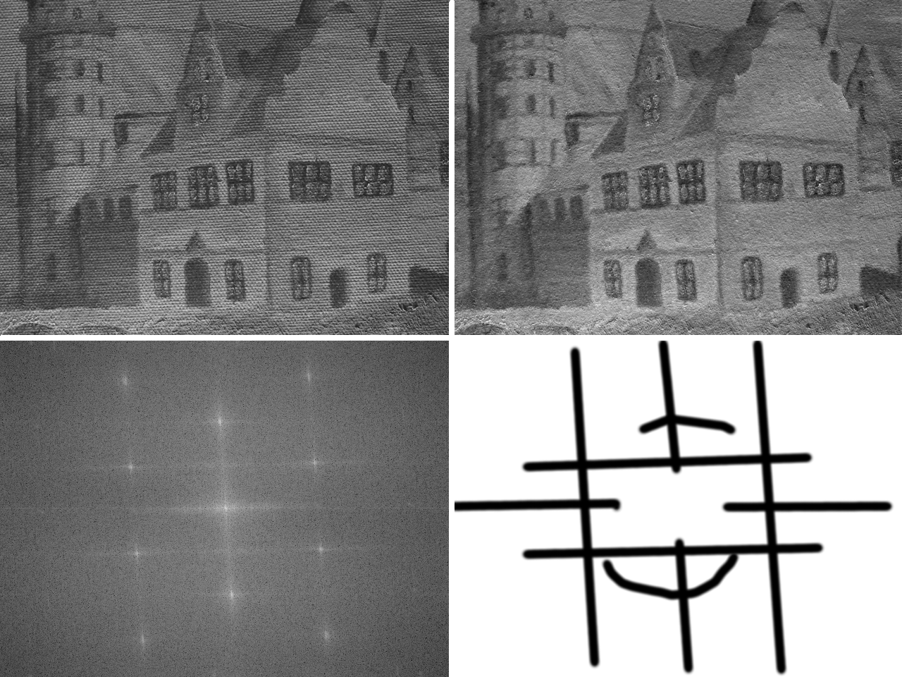
Edge detection is basically convolving an image with an edge pattern. Patterns that add up to zero, often small patterns, are called edge pattern. In this exercise, the edge patterns are just  matrices that are padded with zeroes to reach the size of the image being convolved with. We show an example below and its Fourier transform, to show why it is an edge pattern.
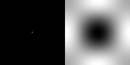
Figure 6. The edge pattern on the left, and its FFT. Multiplying this FFT to the FFT of any image and applying IFFT to it will give us the edge of the image. This is because the edges of the objects in any image can be seen as the high frequency parts of the image.
There are many different edge patterns. The edge pattern in figure 6 has the following matrix:
-1 -1 -1
-1 8 -1
-1 -1 -1
We call this the spot pattern. We also have the horizontal, the vertical, the diagonal, all shown below
-1 -1 -1 -1 2 -1 2 -1 -1
2 2 2 -1 2 -1 -1 2 -1
-1 -1 -1 -1 2 -1 -1 -1 2
We can also manipulate the spot pattern such that the number 8 is off-center. We can have the following matrices
8 -1 -1 -1 8 -1 -1 -1 8 -1 -1 -1 -1 -1 -1
-1 -1 -1 -1 -1 -1 -1 -1 -1 8 -1 -1 -1 -1 8
-1 -1 -1 -1 -1 -1 -1 -1 -1 -1 -1 -1 -1 -1 -1
and the following:
-1 -1 -1 -1 -1 -1 -1 -1 -1
-1 -1 -1 -1 -1 -1 -1 -1 -1
8 -1 -1 -1 8 -1 -1 -1 8
If the number 8 is off-center, we call the matrix depending on the position of the 8. So the above matrices are called, from left to right, top to bottom: northwest, north, northeast, west, east, south west, south, and southeast. Using the above matrices as edge patterns, we apply convolution with edge pattern and the VIP image. For the horizontal, vertical and the diagonal edge patterns, the results are shown in figure 7.

Figure 7. Edge detection with horizontal, vertical and diagonal edge patterns (from left to right).
We can see in figure 7 that the edge that is most prominent is the edge that follows the edge pattern. For the horizontal edge pattern, the horizontal edges are the most prominent. Likewise for the vertical and the diagonal edge patterns. Figure 8 shows the edge detection using the 9 different spot edge patterns.

Figure 8. Edge detection using spot edge pattern. The left images show the result after using edge spot patterns for edge detection. The placement of the image correspond to the placement of the number 8 in the 3 x 3 matrix used. The right image shows the FFT of the spot edge patterns, with the placement of the image, again, corresponds to the placement of the number 8 in the 3 x 3 matrix.
From figure 8, we can see the the southwest and the northeast edge patterns are the same. The same goes for the northwest and the southeast; the north and the south; and the east and the west. These edges can be used for determining the area of the image by using the Greens theorem. Images can have different prominent lines, so the optimal edge pattern is different for each image.
I have shown the tip of the iceberg of the uses of the FFT. There are a lot of uses of FFT in many different fields, particularly in sensing and signal processing.
The author gives himself a grade of 10/10 for completing the minimum requirements needed for this activity.
Acknowledgements go to these sites:
http://fourier.eng.hmc.edu/e180/e101.1/e101/lectures/Image_Processing/node6.html
https://en.wikipedia.org/wiki/Fourier_transform
http://www.mathsisfun.com/data/correlation.html
http://en.wikibooks.org/wiki/Signals_and_Systems/Time_Domain_Analysis
I will not place here the codes that I have used.


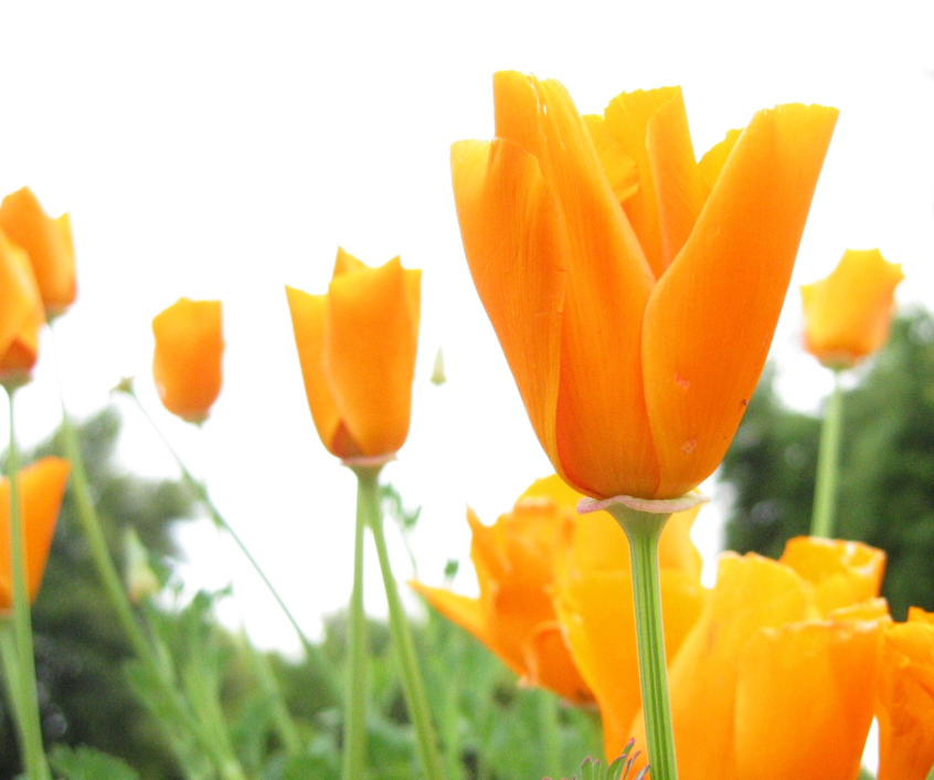
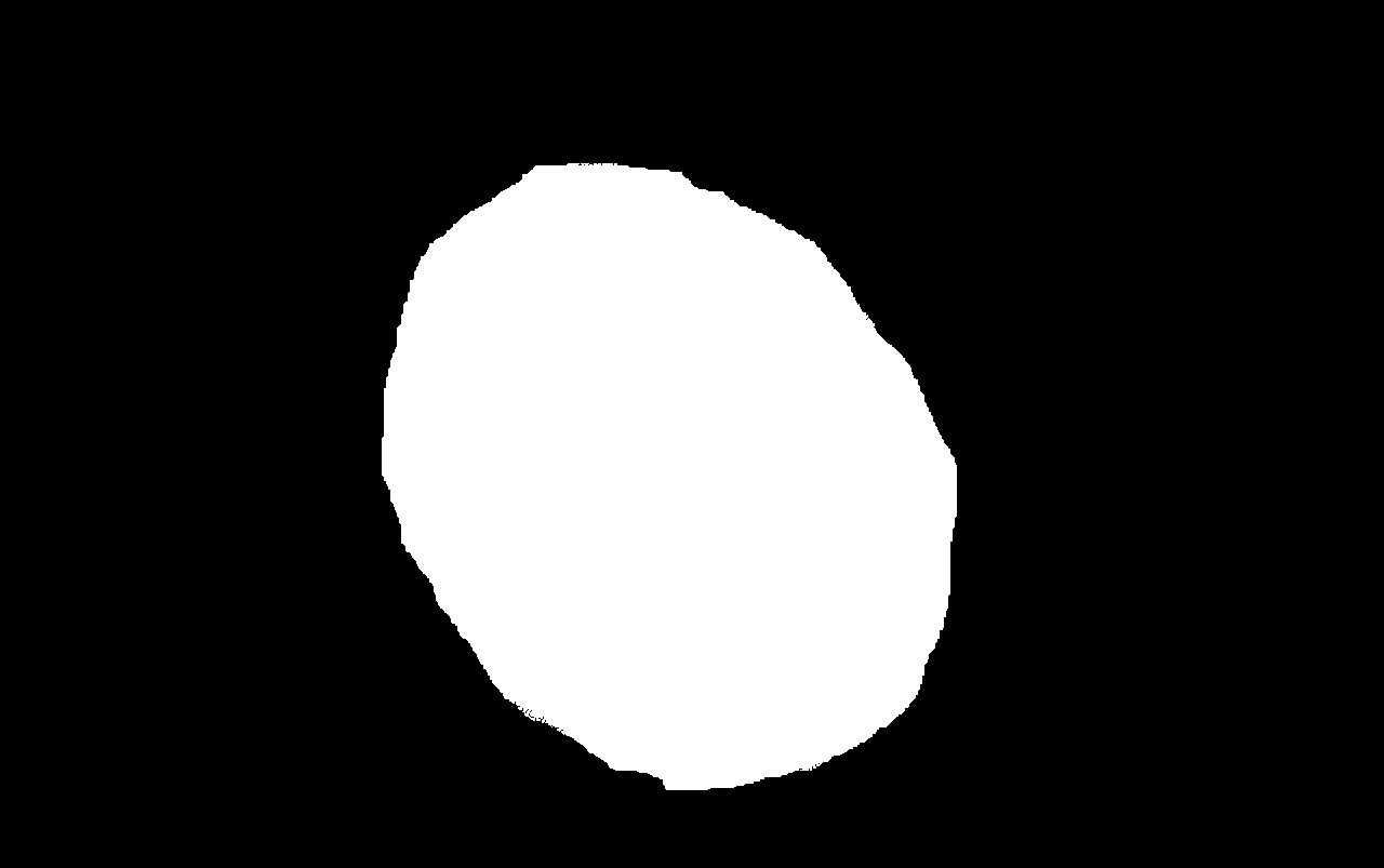
 Figure 3. The flowers are separated from the other parts of the image.
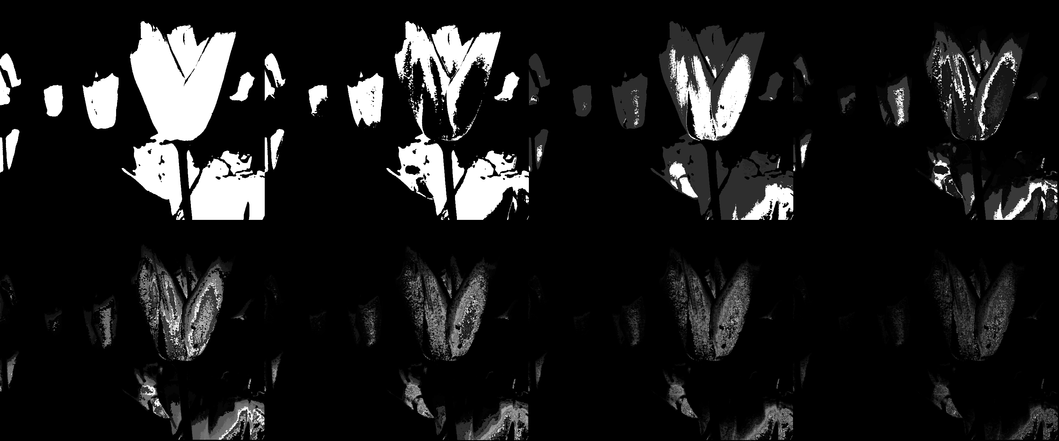 Figure 4. left to right, top to bottom: bin size = 2, 4, 8, 16, 32, 64, 128, 256
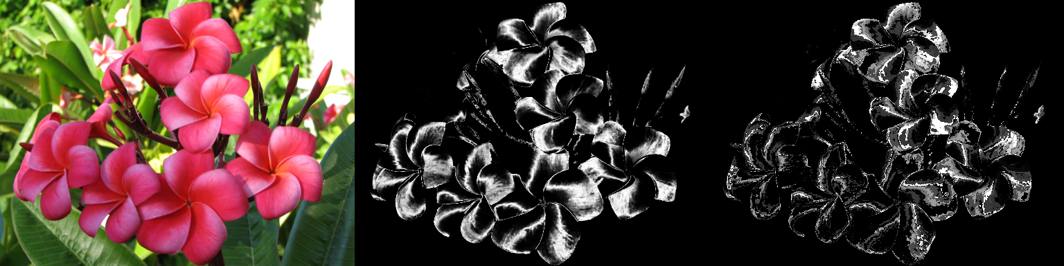 Figure 5. The left image is the original, center the result of parametric segmentation, and right the result of non-parametric segmentation. The difference between the quality of parametric and non-parametric segmentation is seen. The parametric segmentation captures more area of the flowers.
 is the coefficient for the function
  . The functions
  and
and  can be obtained using a single line of code. . If X is the matrix containing the signals (each column being an individual signal), the principal components and the coefficients can be obtained by:
![[lambda, facpr, comprinc] = pca(X);](https://s0.wp.com/latex.php?latex=%5Blambda%2C+facpr%2C+comprinc%5D+%3D+pca%28X%29%3B+&bg=eeeae8&fg=4a4a49&s=0&c=20201002)
 parts. Then we convert each part to a single matrix with size
  . Each
  .
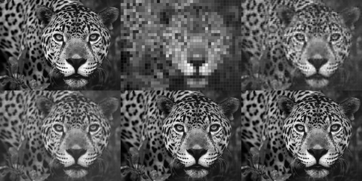
. principal components. What we will then do is try to reconstruct the images using the principal components. Because each principal component have different percent contribution, we will investigate what will happen to the reconstruction if we use only n principal components (0<n<100).


 is the Fourier transform operator. I have already performed some convolution myself. Figure 1. shows a the result of convolving circles of different sizes and their Fourier transforms.